Latest news, events, and updates on all things App related, plus useful advice on App advisory - so you know you are ahead of the game.

Unlock the power of visualization with our new graph options. Easily communicate data and discover patterns in the way that suits you best.
The benefits of visualization are abundant. Charts and graphs are a far more effective form of communication than long lists of numbers and words on a page because the human brain is programmed for pictures.
As Maryanne Wolf explains in her book, Proust and the Squid: The Story and Science of the Reading Brain, "We were never born to read." Rather, we were born to decode images and symbols within the "visual circuits" of the brain. Visual images are much easier for us to process than numbers and words and we interpret them more quickly.
By visualizing your data, you are able to unlock key values, identify patterns, gain a better understanding, and capture the attention of your clients, staff, stakeholders, investors, or whoever you are sharing these graphs with. Visualizations are also useful for displaying complex relationships. And today, we are proud to present a host of new visualizations in our Visualize section.

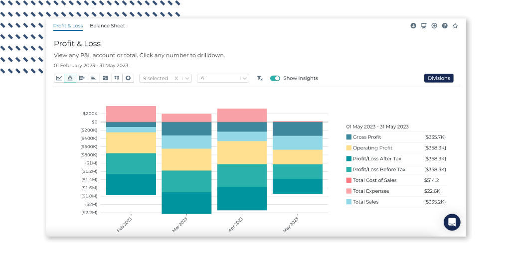
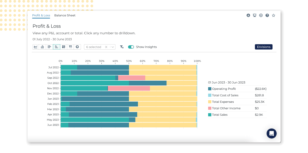
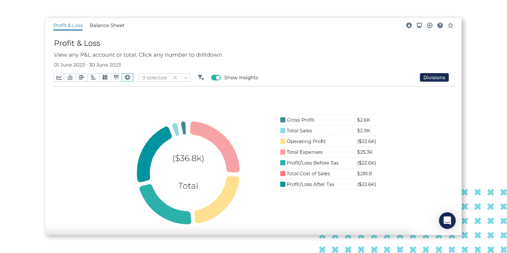
In the past, we had two standard graph options for your Profit & Loss and Balance Sheet accounts. We've now expanded to include all kinds of visualizations so that you can represent your data in the way that makes the most sense to you. The graph options to visualize accounts are:
Line graph;
Stacked bar graph;

Horizontal bar graph;
Normalized horizontal stacked bar;

Treemap graph;
Partition icicle graph; and
Donut graph.

Not sure which graph works best for you? Why not play around a bit with these new options and see what you find?
Looking for some of your favorite graphs, but can't seem to find them? Don't panic. We've shifted a few things around in the hopes of making Syft a bit easier to navigate. KPIs & Accounts has moved to its own menu under Visualize along with our beloved Profitability graphs.
That's it for now. We hope that you will enjoy the additions to Syft's graph options. Until next time, happy visualizing!
Latest news, events, and updates on all things App related, plus useful advice on App advisory - so you know you are ahead of the game.