Latest news, events, and updates on all things App related, plus useful advice on App advisory - so you know you are ahead of the game.
Connect with us


Simplify your financial data management and gain deeper insights into your chart of accounts with our user-friendly tool.
New feature! Layout hierarchy update
Syft Analytics understand that managing your chart of accounts layout can be a complex task. With the new layout account hierarchy, it's easy to make sense of the different accounts within your layouts and where they fall.
With our new account hierarchy feature, gaining insight into the intricate details of your accounts within layouts is a breeze. Whether you have nested accounts or complex categorizations, our enhanced visualization will help you make sense of it all.
How it works
Accessing account hierarchy: To access the account hierarchy view, simply navigate to "Layouts" under the "Configure" section. At the top right corner of your screen, you'll find a toggle for "Account View." Turn it on.
Explore with ease: Once in Account View mode, hover over any account within your layout, and you'll spot an organogram icon. Click on "View Hierarchy" to open up a comprehensive list of accounts, categories, and groups associated with that specific account.
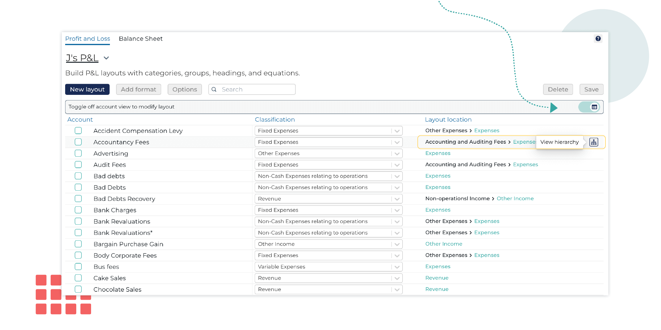
No more endless horizontal scrolling to grasp the complete hierarchy. Our new feature automatically zooms out to display the full family tree of accounts, groups, and categories. You can now scroll in and out infinitely, collapsing categories as needed to streamline your view.

With our enhanced account hierarchy visualization, understanding your chart of accounts in Syft has never been so simple. Gain deeper insights into your account layouts, especially when they are nested within multiple categories.
Stay tuned for more updates and enhancements as we continue to elevate your Syft Analytics experience.
Latest news, events, and updates on all things App related, plus useful advice on App advisory - so you know you are ahead of the game.