Latest news, events, and updates on all things App related, plus useful advice on App advisory - so you know you are ahead of the game.

Syft has revamped dashboards so they're easier to edit and share. From intuitive navigation to improved sharing options, dashboards are even better.
Financial data lies at the heart of every invoice you send out, every bill you receive, and every loan you apply for at the bank. It populates your accounting software and spreadsheets, line after line after line.
It can be tough to decipher the details in this avalanche of information – unless you have the right tools. Syft's dashboards metamorphose this jumble of numbers into a beautiful butterfly of actionable insights for you and your clients, colleagues, and investors.
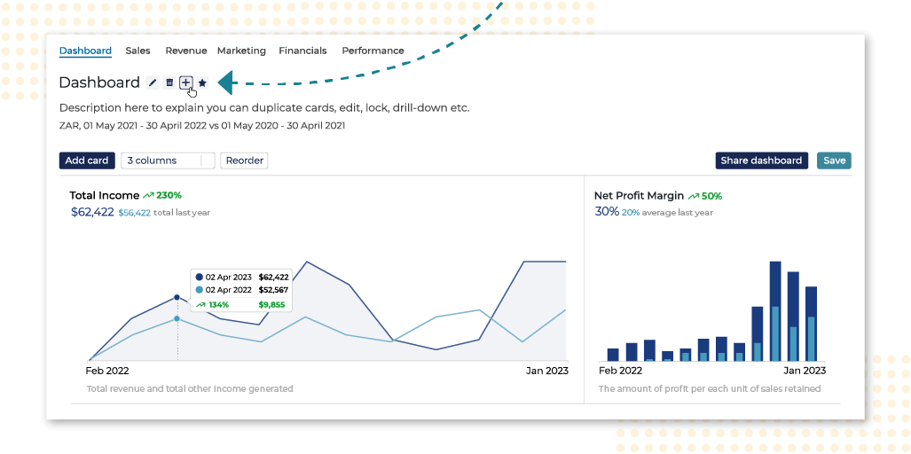
This week, we've remodelled our beloved dashboards to make them easier to edit, share, and interpret. From more intuitive navigation with new buttons and hover boxes to improved formatting and sharing options, our fan-favorite just got even better.
First thing's first, there's now a clear "➕" icon for you to add new dashboards with ease. Next, our engineers implemented new styling for the totals and period in each card to provide more clarity. And, thirdly, when you hover over a graph in your dashboard, a hover box will now appear that illustrates both current and prior period data to give you a quick view of this vital information.

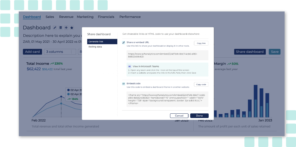
In addition, sharing dashboards has never been so easy to do. It's as simple as clicking the "Share dashboard" button at the top right of the dashboard screen. Sharing your dashboard is great because it means that stakeholders and clients can view and interact with dashboards without having to log into Syft. What's more, the dashboard you share is totally interactive. You can share a link to your dashboard as:
A URL;
A link to embed in Microsoft Teams; or
Code to be embedded in the iframe of another website.

And you can set whether you want your data to update as time passes by switching on the rolling data option.
Note 📝: Toggling rolling data on will change the share or embed URL & the embed code. Therefore, you must ensure that you copy the latest link or code when sharing or embedding your dashboard.
In addition, you can now:
See the absolute percentage change when the data is formatted as a percentage; and
Use the layout you have selected when downloading a report pack (in the past, Syft would always use default layouts).
Moreover, the prior period description now correctly applies to the selected view as option (for example, "last year” for monthly, “last 31 days” for daily, and so forth.)
Note 📝: If you are on the Basic plan, your Dashboards will have a watermark when shared.
Dashboards help you to keep tabs on key metrics in your business and make sense of what's really going on. I hope that you will find our latest updates to dashboards to be beneficial. Feel free to let us know what you think!
Latest news, events, and updates on all things App related, plus useful advice on App advisory - so you know you are ahead of the game.